This is going to be a long post, so understand that past this cut is a
ton of information and images. I am going to be going over the very basics of coordinating and creating a visually appealing outfit utilizing coordinates with an overall positive response from the Lolita community in general. I get a lot of messages, questions, and general comments about how to make a great coordinate. I hope this post answers all of those questions, and helps provide a guide to the nagging question:
How do I create an excellent
Lolita fashion coordinate?
Coordinating an outfit can come completely naturally to someone; someone with a “good eye” can easily put items together without much thought as to the reasons why the coordinate works so well. For others, this task is daunting, and putting the pieces together feels like an impossible jigsaw.
Let’s start with debunking some common myths for great Lolita fashion coordinates:
“You must be a certain weight, height, skin tone, gender, etc. to look good in a coordinate.”
I do not understand why people are so stuck on this notion that certain figures, colors, genders, etc. are the only ones that could possibly look good in Lolita fashion. If you feel that way, you are being discriminatory – period! Now, this does not mean that every single coordinate created by a plus-sized Lolita, tall Lolita, minority, etc. is perfect – it just means that
anyone can create a beautiful coordinate, no matter your situation with the right cut, color, and style (of the clothing - not the person!). Even those who fit in the so-called “ideal Lolita body type, skin tone, etc.” can create really terrible outfits.
“Only those of Asian descent look good in Lolita fashion coordinates.”
I separated this from the top comment because it is quite possibly the most outrageous thing I have ever heard, and I hear it often. First of all, Asians do not have this automatic “get out of jail free” card that lets them wear whatever the heck they want and it has to be treated as amazing. Second of all, the inspiration for this fashion stems partly from Victorian and Rococo periods, both of which involve Europeans. So no, you do not need to be part of an Asian ethnicity to look great in your Lolita coordinate.
“Creating a good coordinate involves a lot of money, or only store-bought items.”
You are checking out the latest outfits posted online, and every single one seems to be covered in head-to-toe brand. News flash – most Lolitas do not wear head-to-toe brand; we just replace certain items that really do not need to be brand with great off-brand or handmade items! Also, let’s not forget the handmade Lolitas! These people can create masterpieces with their hands. Again, does not mean that every single handmade Lolita piece you see is the best thing ever – it just means that it can be.
“After a certain period of time, you will suddenly have the magical ability of putting together excellent coordinates.”
If only this was true! Then I would not need to write this post! I would just tell everyone to wait about 2.5 years and then suddenly you will create the most amazing coordinates ever! It does not work that way, and just because you may have been wearing Lolita fashion for 30 years does not mean that you are wearing it well. Veteran Lolitas, as I like to call them, have been around long enough to absorb a lot of material, and hopefully that information rubs off into their own outfits. Sometimes, though, it does not, so for those who claim, “Well, I have been in the fashion for 40 years!” – Your point is moot. It does not matter.
“Only certain fabric colors are involved in good coordinates.”
Bah! You
clearlyhavenot readall thesefabulouspostsaboutunderratedcolors in the Lolita fashion world. These few in particular have awesome pieces from brand, and
you can check out my own post on the topic to see some example coordinates using these non-popular colors.
“Beat up, torn, dirty, cheap quality, or otherwise obviously used items can be used in a great coordinate.”
There is frugal, and then there is cheap. Frugal Lolitas will find great deals on great condition items, or make items at home to help lower the costs using good materials. If you decide to purchase items made of a sub-par fabric or lace quality, or make some on your own, you are not saving money – you are losing it. Not because you will not be able to sell your items to the community, but because eventually, those items will literally fall apart from the cheap materials, or you will realize that your poor choices on materials make a very cheap looking outfit. Remember, Lolita fashion is supposed to be a very luxurious fashion. Should you shell out $1,200 USD for a single dress? No, that is not necessary, but you need to spend a reasonable amount of money to obtain good quality materials.
On that note, items that are beyond repair and have seen better days, or are just filthy in general, cannot be used in a good coordinate. It just does not look clean, and you will not be fooling anyone unless you get involved with some serious Photoshop. If the item needs repairs and can be salvaged, definitely do so!
Now that we have debunked the myths surrounding Lolita coordinates, let’s start from the very beginning, before even touching a piece of clothing.
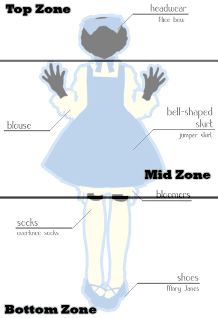
In Lolita fashion, there is a blatant rule of thumb that you will see with a lot of outfits, whether the person wearing it realizing it or not. I like to call it your different “zones”. Each zone is separated like so:
![]() from LolitaFashion.org, modified by Ramble Rori
from LolitaFashion.org, modified by Ramble Rori
As we go over good color combinations, I will make mention to balancing out the colors by a ⅔ rule or to be heavy on one color than another. When I say that, I mean to balance the colors throughout these three zones appropriately, that way everything looks even to the eye.
Even in the example model, you can see the main color - blue - showing up in each zone; the blue head bow, the blue dress, and the blue shoes. This is a very simple, example coordinate, so obviously it does not need to follow this precise method of a single color in every zone, but through examples I am going to provide, you will see the similarities pop out as I point them out to you, and how people naturally (and unnaturally make sure) that their zones are covered for an awesome outfit.
It is time to break out your color wheels as we traverse into color theory**! It is OK if you do not have one; I have provided this fantastic one right here to help guide you on your journey!
![]() Color wheel courtesy of academichic– awesome, right? :D
Color wheel courtesy of academichic– awesome, right? :DAs you can see, the colors basically float together in a nice round circle, each color related to the color on either side of it. The colors on the inside are your pastels, or lighter versions of your primary colors. The main circle features primary, secondary, and tertiary colors. The colors on the outside are your darker hues, like navy, olive, and plum. There may be other colors with different saturation tint, and tone you could come up with, but these are the basic colors you see in general everyday life when dealing with fashion.
Colors have relationships with each other – they are completely in love with some colors, and completely hate others. This is where the magic of coordinating happens, and where some people just naturally understand this balance (and some people need a little guidance ;) ).
First, there is the very basic
monotone category. You essentially pick a single color and use it throughout the outfit. Kuro or Shiro Lolita anyone? You do not need a color wheel for this one - you just pick that color and stick to it! The key to making this coordinate amazing is to use pieces of clothing with lots of texture and dimension so that the coordinate does not lie flat and lifeless. A common use of this color category is with black or white.
Any
neutral or natural color can be paired with any of the color combinations below or by themselves. This is why you will commonly see veteran Lolitas tell you that having a basic black, white, ivory, or brown blouse, socks, dress, etc. is great to have in your closet; these colors can easily be added to an outfit full of color to help decrease the heaviness of a color or if you don't necessarily have the item in the exact color you want. You will notice
Caro's basic wardrobe post has these basic elements in every combination she features.
Neutral colors include - black, white, brown, and any variations of those colors (so other hues like gray and tan are included in this).
So let’s say you like a certain color, but you don’t have a lot in the same hue. That is perfectly fine! Here’s where you see a lot of coordinates in Lolita fashion turn to - picking a color and getting other colors that are only slightly different to pair with it. This is called
analogous colors. These colors are very close to each other on the color wheel, neighbors if you will, and they love getting together and creating magic. An example of these color combos include:
![]() |
| Modified by Ramble Rori |
Feeling blue? Bunching together these hues of greens and blues bring together a cool and collected outfit. These examples utilize a similar palette.
From here, we can talk about the
accent color coordinate. This features a single color with one other color only in very small amounts as an accent to the main color. Think monotone, but with a dash of something else to give it more dimension if the outfit does not have a lot of texture and depth.
Complementary colors are colors that sit directly across from each other on the color wheel. These colors can naturally be paired together, but because they are usually both bold colors next to each other, you have to follow a ⅔ rule. Basically, you need to balance out the colors so that one color is taking up at least ⅔ of the outfit, where the other color only occupies ⅓. For a visual, see the example below:
![]() |
| Modified by Ramble Rori |
The colors can be primary colors, like red and green. Some people immediately scream out Christmas when these colors are paired together, especially equally. To come off less harsh, focus with more red as the base with green as the accent, or vice versa. A red blouse and a green skirt with equal parts will not come off pleasant to the eye.
![]() |
| Modified by Ramble Rori |
They do not necessarily have to be primary colors, and can be secondary colors instead. This shows how purple and yellow are complementary as well. Of course, the ⅔ rule still applies, so pairing a mostly plum outfit with yellow accents can be really beautiful!
![]() |
| Modified by Ramble Rori |
This includes different saturation as well, so navy and dark red would fall together nicely as well.
Going into more advanced territory (new Lolitas, try out the easier combinations above before going into these!), Triads are a much harder palette to balance well. They include colors that are form a triangle in distance from each other. Think complement colors with their neighbor involved as well. This is where you see those coordinates where you are like, "Those colors should not work, but somehow it does."
A hard coordinate to balance well, this would feature three heavy primary colors in a single go. Can you master this triad of colors? Remember, keep that ⅔ rule in mind - pick a color you want to focus on and accent with the other colors.
A much more common occurrence, Sweet Lolitas will often pair up many of their pastel colors together to create a rainbow infusion of sweet, light colors. This is why prints will so many different colors in the Sweet realm tend to work out well (or not - there are several questionable prints in mind that go over that line of too much).
Please remember that I am showing you examples of each category - this does not mean you cannot do different examples of the same type of color category! So if you see monotone and you want to do all yellow, that's fine - you are still doing it right!
We have gone through colors, but that is not the only thing that determines a fully functional fabulous coordinate.
Cut plays an important role according to what your
body type is. Before we get into body type, let me say this - you have seen these body types before, and I always see this comment, "But that does not apply to me, I am plus size, this is only for average or thin sized people!"
That comment is simply
not true. It does not matter your size, body type is based on your shape, no matter how small or large it is.
I did not like the current images out there representing body shapes, so I created my own. Instead of extremely awkward names like "cello" and "brick", I decided to number the shapes because quite frankly, being told your body is shaped like a brick is depressing. I found the silhouette image from a
clip art website and modified it with what body shapes, I feel, occur within Lolita. This is not based on your height or weight - simply by what your bust, waist, and hip measurements are. From these shapes, you can determine what dress styles and cuts look better on you! Not every dress made looks good on every single person.
Keep in mind that your bust measurement is your
over bust - meaning, the measurement from the largest point of your chest (over your chest), not your bra size, which is your under bust measurement.
![]() |
| You may find that you fit either a combination of these shapes, or not at all! Find a part that you can identify with, such as that your bust is smaller than your waist, and go from there. |
For example, a person with the measurements of 50" - 39" - 49" would be shape #1. Someone else with the measurements of 34"- 36" - 41" would be shape #6. Another person with the measurements of 32" - 26" - 30" would be shape #4. Regardless of weight or height, the shapes would still apply.
Now that you have your shape, we can discuss what looks better on your figure. Certain proportions look better in certain cuts of clothing and styles of dress. Something that is heavily embellished on the bust may look overpowering on someone with a shape #3 or #7, but balance out someone else with a shape of #2 or #6. The guide below will show how certain cuts and styles look on certain shapes.
You may have heard the comment, "Lolita fashion redefines your body shape to essentially an exaggerated [shape #1] figure, so it does not matter what your body type is - everyone looks the same in Lolita fashion."
Although I do agree that Lolita fashion redefines your figure to basically have a similar silhouette as the next Lolita,
I do not agree that it does not matter what you wear. Lolita fashion may not have a wide variety of cuts and styles, but the difference of how a certain cut looks (to something as simple as a type of sleeve) can be the difference of an OK outfit to a fantastic outfit.
You now have your colors, your shape, the cuts and styles that look good on you, so what is next? That is up to you! Now you can fall in love with your favorite style, find clothing items that will look fantastic on you, and rock out your next coordinate!
Everything I talked about in this post can be used in most normal fashion styles out there, so feel free to use these methods when doing something outside of Lolita fashion as well! There is
so much information on how to coordinate, color theory, what works/what does not, and several differing opinions on the matter, but I hope this post gives you enough to at least think about when you are coordinating your outfit. Hopefully, for those who are completely lost, this can point you in the right direction.
This goes without saying, but obviously, once you get the basics down, experimenting is your friend! There are coordinates out there that break these guidelines completely and still look fantastic. That is the
je ne sais quoi that some people have that others strive for. Some people are just really good at coordinating their outfits without much effort or true guideline as to how they do it.
This guide is not a limit to what you can do, but a basis to build your coordinating skill foundation off of. * All coordinate photos have been used in previous Frills Friday posts on this blog with permission from the model in the photo. Please contact me if you are the photographer and would like credit as well.** Color theory basics sources: http://www.tigercolor.com/color-lab/color-theory/color-theory-intro.htm
http://www.colormatters.com/color-and-design/basic-color-theory
http://www.color-wheel-pro.com/color-theory-basics.html
http://fashionablemathematicianfashion.blogspot.com/2008/05/color-theory-introduction.html
http://www.academichic.com/2009/02/02/fashion-101-how-to-combine-colors/*** There are other color combinations available that involve different methods like arrow (a single color and then two colors across from it that create what looks like the end of an arrow), but I decided to stick with the basics on this post.The Unfinished Series is a collection of drafts that have never been published over the years of having this blog. I have been rehashing these posts over and over again because I am too nit-picky about the tone or what is being said in the post. After talking with other blogging friends, in particular Caro, I have made a decision to try to get these drafts finally published. Some of them may be a little dated in their topic, but I will try to update them before they go up to keep them current.


.jpg)